State Flags Ranked by Ugliness
At brunch in Brooklyn recently, I saw a guy with a huge Zia symbol tattooed on his arm. So of course, I bounded right up to him and showed off my Zia symbol tattoo, and we bonded over our shared home state. I’ve had some version of this interaction many times, which has led me to place an awful lot of importance in state flags. And you all know how much I love a ranking. Hence:
The State Flags, Ranked by Ugliness!
I was going to call this list Most Beautiful State Flags but most of the state flags in this country are straight up ugly. I understand that statement may hurt any future national political career I may have, but I’ve already ranked the Kennedys by hotness, so really, how much worse can it get?
Let’s rank this ugly ass flags.
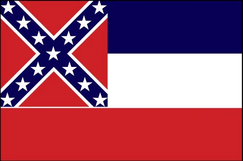
50. Mississippi
Well you’re not even trying to put away your sordid history of the oppression and enslavement of black people, are you Mississippi? You decided the best thing to do was take a flag of rebellion and put it right into your state flag. It’s an embarrassment and you should get a new flag as soon as you can.
49. Maryland
It’s like Maryland held a contest for which patterns were the ugliest and then picked the top two ugliest patterns and were like “wow we can’t decide between them. Let’s put them both on the flag, and alternate them, so it really overwhelms the eye. Nothing says ‘Maryland’ like ‘oh god get that out of my face!’”
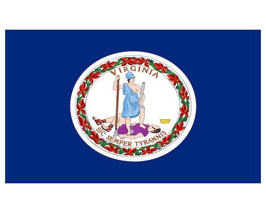
48. Virginia
Props to the flag designer who thought, let’s just go with murder as our flag theme!
47. Washington
Every flag needs a poorly rendered portrait of one of our founding fathers! Someone picked the worst shade of green imaginable, halfway between a Kelly green and a puce, and put a clip art George Washington on there, and called it a day. D- grade, you need remedial design courses.
46. Alabama
You’re not fooling anyone. I know what you’re trying to do Alabama. This is like how the Union Jack is made up of bits and pieces of the other flags of the British Isles, but it’s the opposite. Alabama thought they could just take a piece of the Confederate flag and no one would be the wiser. But not today Alabama. Not today.
45. Delaware
You have all the colors in the world, and you went with muted blue green and muted yellow. If you look closely, you’ll see that the people on this flag look like they were drawn by a mildly talented seven year old, and the cow looks like it was rendered in MS Paint. Are there no artists in Delaware? Did they all flee to New York?
44. New Jersey
Hideous color, but it does have the decapitated horse head to honor their main export, the Godfather.
43. Massachusetts
I was going to dock this flag anyway (I’m not a huge fan of putting a stereotypical Native American on the flag) but then I saw disembodied sword hand and that made the flag so much worse. Bad use of white too, you can’t have that much empty space when your main design sucks.
42. New York
This flag is so ugly. New York, you have almost every creative artist ever and you went with this crap? Back to the drawing board. Fix it.
41. Wisconsin
Either people couldn’t draw in the 1800s or whenever it was these states came into the union, or every state redesigned their flag when clip art got invented. Either way, rethink the font choice. It’s hurting my eyes.
40. Louisiana
I want to like this flag, I really do, but honestly the bird is overwhelming. It’s too large. I wish the little birds were cuter, but they’re just scaled down versions of the terrifyingly large bird.
39. Florida
Falls victim to what happened to Alabama, but at least they added a little seal so it’s not just a weird X warning you not to live there.
38. Nebraska
If you’re going to have a seal that busy, you need more than two colors.
37. Utah
Is it just me or does the eagle look like he’s pooping? It’s like America is taking a shit on all of Utah.
36. Arkansas
So many flags feel the need to remind us, in words, of what state they are. This is because those states don’t have anything visually appealing or interesting about them. Arkansas tried to make up for that with stars. It didn’t work.
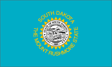
35. South Dakota
The only thing worth doing in South Dakota is going to Mount Rushmore, apparently. They’re really resting on that one thing, to the point of telling us South Dakota is the Mount Rushmore State. We get it guys.
34. New Hampshire
The boat is nice, although I’m not sure New Hampshire has any real coastline to speak of, but this was the 1700s. No one knew how maps worked.
33. Minnesota
I’m not sure what the years refer to, it appears part of the flag is in French, and once again they have the two people of the state: farmers and stereotypical Native Americans. God, lots of these flags make it look like everything was totally chill between settlers and Native Americans. And it very much...was not.
32. Kentucky
Disingenuous depiction of a Native American and a settler shaking hands. You’re not fooling me Kentucky, this wasn’t a nice handover. And that blue is hideous.
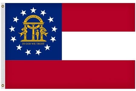
31. Georgia
They saw the United States flag and were like, yeah let’s just go with that. Make one or two changes so they don’t think we totally copied it. Put some birds in. I don’t know.
30. Nevada
They kept it simple. The color is pretty gross though.
29. North Carolina
Huh, this kind of looks like Georgia, but the design in the blue part is less distracting and confusing than Georiga’s, so it gets higher billing.
28. Iowa
I hate how the banner is rendered here. And it looks like a French flag with the wrong proportions.
27. North Dakota
Yes, it’s an ugly eagle with banner, but the sun made of stars is rising out of the eagle mouth which is pretty cool.
26. Pennsylvania
The horses are certainly majestic but I also feel like they’re ghost horses that are going to kill me.
25. West Virginia
The addition of local flowers was a lovely call.
24. Maine
Why all the flags with two people? The only two genders in Maine are sailor and farmer. Those are the only people of Maine. Pick one.
23. Vermont
Severed deer head and a tree. Vermont knows what they’re about and it’s maple syrup and dead animals.
22. Connecticut
I don’t know why there are grapes but I appreciate it. Lemons too. Connecticut is really working with a fruit theme, despite the fact that they probably don’t grow any fruit.
21. Hawaii
Yeah, it’s a rip off of Britain’s flag but Britain has a nice flag.
20. Oklahoma
Now, I will allow this Native American imagery, because at least when Oklahoma was admitted to the union, there were Native Americans in the state, unlike all these other states with Native Americans on their flags.
19. Missouri
Double bears? Absolutely. I wish this flag was just the two bears, but they had to ruin with the stars and the incredibly busy state seal.
18. Michigan
I burst out laughing when I saw this flag, so I’m ranking it high. Two giant moose? Incredible. Brilliant.
17. Oregon
We’re only judging the side with the beaver. Oregon would be wise to forget about the other side and just go with beaver flag.
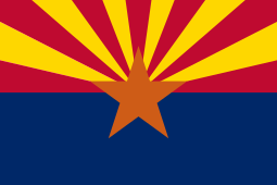
16. Arizona
I hate this flag. I hate it so much. The red/yellow/blue combo is bad enough but then they threw in the orange star? Is the star rising like the sun? What is going on Arizona! I hate it, but it’s still better than any of the flags with a busy seal or the literal name of the state, so it’s higher than I thought it would be.
15. Indiana
Oh it’s an ugly flag, but at least they have the spirit. They knew they had to go with a picture, not a busy seal and they did their best. The colors kind of go well together.
14. Illinois
Well, they kind of stole the eagle eating a snake concept from Mexico, but they knew that less is more when it came to flag design, and made the choice to go with all white. Really draws the eye to the eagle.
13. Ohio
Lots of points for doing the daring thing and going for the non-traditional shape. Lots of respect to Ohio for that. It’s a little busy though. The red circle inside the white circle surrounded by way too many stars? Pick one thing Ohio.
12. Idaho
Forgive me, I find this flag totally delightful. Sure, it has a weird seal, but I like the pretty river! This is my kind of flag. This flag makes me want to go to Idaho.
11. Montana
Montana combines a detailed representation of the natural beauty with a simple block color. That little picture really makes me want to visit Montana! Loses points because it feels the need to remind us that we are, in fact, in MONTANA.
10. Kansas
If you liked MONTANA, you’re going to love KANSAS. Just like the Montana flag, but it’s better because of the sunflower.
9. Texas
If we’re ranking flags by how many state residents tattoo it on themselves, Texas is second only to New Mexico. The flag is simple, understated, but memorable.
8. Tennessee
Loses points for the unnecessary strip of blue, gains them back for the three stars relaxing in a hot tub.
7. Wyoming
“Wait, we can put animals on the flag?”
“I don’t see why not, California did it.”
“We’re gonna do a buffalo.”
“Perfect.”
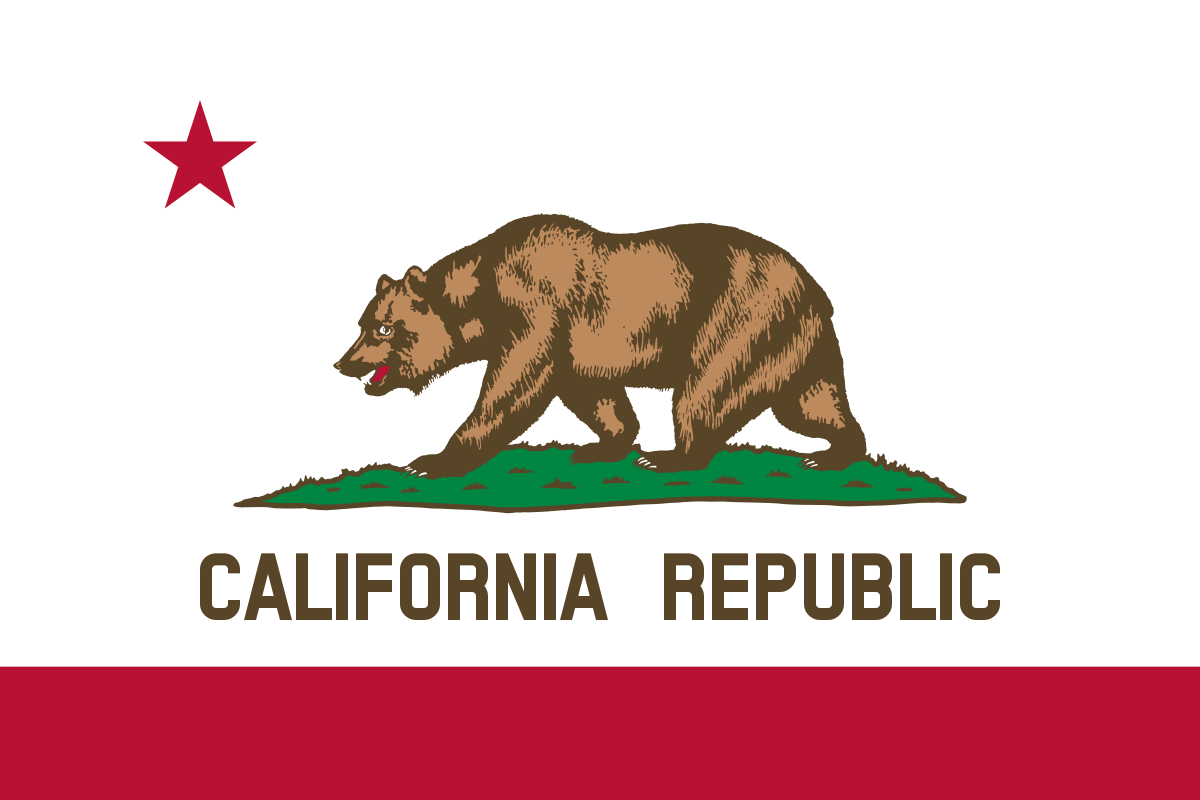
6. California
“We should put a bear on the flag.”
“Yeah I like that, we’ll work it into the seal or something.”
“No. Just a bear. The whole flag is a bear. We are the bear state.”
“Ok. But what if people forget where they are.”
“Just use big text to remind them that they are in fact in California.”
“Sounds good, I think we’re done here.”
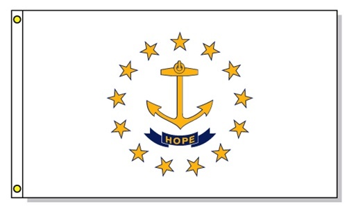
5. Rhode Island
This is a flag that’s ready for wine coolers at the shore in the summertime. An homage to their coastline and though the do have text on the flag (which normally knocks a flag down a peg) it’s only one word, and who doesn’t want their flag reminding them to be hopeful?
4. Colorado
What letter does Colorado start with!? Now, I’m not a fan of the red/yellow/blue color combo, as you’ll see when we get to later flags, but the yellow here is understated enough to not overwhelm the eye with a primary color bonanza.
3. South Carolina
Here’s the thing about a flag. It’s a visual medium, so you want to render the identity of a state through an image. If you’re putting words on your flag, you’re doing it wrong. South Carolina understood this, and went with a couple of images that really sell the culture of the state. I will say though, having been to South Carolina, they’d do well to also put oppressive humidity on it, but that’s hard to render pictorially.
2. Alaska
Unlike other states, Alaska knows that political boundaries mean nothing and we’re all looking at the same sky. Alaska has an appreciation for nature. Alaska encourages us all to look to the North Star, and I think that’s beautiful.
1. New Mexico
You knew this was coming when you started the piece, didn’t you? Now THIS is a goddamn flag. Striking color contrast, ancient and meaningful Native American symbol. Simple, easy for children to draw. The instantly recognizable Nike Swoosh of state flags.
You doubt me? You don’t think this is the best state flag out there? Well let me ask you, do you have your state flag tattooed on your body right now? You don’t? Well. Then I don’t think you can really talk about a good state flag, can you? There are, at a conservative estimate, thousands of people who have chosen to put this symbol on their bodies forever. Next time you meet a New Mexican, ask if they have this tattoo. 9 times out of 10 (particularly if you’re encountering them outside of New Mexico) they will. And 9 out of 10 New Yorkers don’t have their state flag on their bodies. It’s a no brainer. The best flag out there is, and always will be, O Fair New Mexico.
